Effective flyer design will grab the eye, compel the recipient to read, and most importantly, give an effective call to action. These goals sound simple enough, but how many confusing, unclear, tacky, or simply ugly flyers have you seen floating around? Here are some pointers on how to design a great, effective flyer that won’t get lost in the shuffle.
Tip # 1: Plan Your Content
First things first – don’t get caught up thinking about colors and pictures before you know exactly what your flyers should say and do. Make a list of the basic information your flyer must cover. For example, if you’re advertising a concert, clearly the band name, venue, and time are of major importance. Then think of information that is secondarily important – for example, what is the cost of a ticket? Where can tickets be bought? Are there restrictions of what ages are eligible to attend the event? Making a list of everything the flyer must cover, and possibly designating each piece of information as “primarily” or “secondarily” important will make the layout and design a much easier process, because you’ll know what you must fit and also have a vague idea of how large to size the different info.
Tip # 2: Get Some Great Images
Original photographs are an excellent way to bring color and vibrance to flyers, when appropriate. When advertising the opening of a new restaurant or specials at a gourmet market or bar, you have a great opportunity to showcase some of the establishment’s more visually appealing options on the front of your flyer. If you don’t have your own images, you can find free stock photos on Flickr Creative Commons, Stock.xchng, or Wiki Commons. (Make sure to give credit to the photographers.) Watch out when “borrowing” other images from the web that may be copyright protected – you will put yourself at risk for legal trouble. But for some other endeavors, actual photographs may not be the best option. If you are offering IT services, some energetic digital-inspired renderings may be a better way to highlight your message. You can try your clip art from programs like Word, Photoshop, Paint, etc., or go online and search resources like clker.com for more royalty-free designs and art.
Tip # 3: Arrange Images Wisely
Let’s say you’re designing that concert flyer we mentioned earlier. You found a mesmerizing image of a rocker on an electric guitar, jamming out with the stars twinkling overhead and wisps of smoke snaking off his instrument. Then you found an image of an excited crowd with its fists pumping in the air. You can stack these two images together on your flyer. Your musician can take up the top half of the flyer and the crowd the bottom. Even if there is a notable break between the two images, it will work once you add in the words. If you’re designing the flyer for a restaurant, you may want to designate the bottom of the flyer for one of the signature dishes and the top for the message or promotion. Or consider placing four smaller versions of different dishes or drinks in each of the four corners of the flyer. You can play around with the placement and size of your images until they strike the right balance, but always keep in mind that the text must also feature prominently on the flyer. When you’re about done, it’s a good idea to consult another person for his or her opinion on whether your picture placement is appealing.
Tip # 4: Create Color Harmony
Sample at least one color from an image that appears in on your flyer and try to add a bit of that color to each of the different images throughout the page. This will cause the viewer’s eye to move around the entire flyer rather than allow it to get stuck on a single image or area of your design.
Tip # 5: Place Your Text Smartly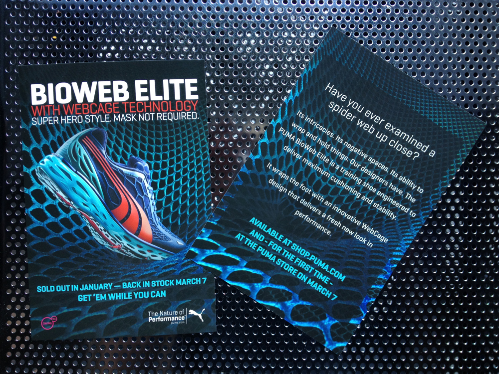
First, create a fitting headline and place it at the top of the flyer. Then add the wheres and whens prominently below. Make sure your font color stands out from the background of the flyer, wherever it’s placed. You may need to use several font colors to accommodate different background colors. Finally, if there are additional details, place them in an appropriate place. Remember to make your text as succinct as possible. If you can say something in fewer words, do!
Tip # 6: Use Bullet Points… Sparingly
Bullets are a great way to highlight key information, but you don’t want to go nuts with them. Try to use no more than five bullet points on your flyer so your finished product doesn’t look like a target on the shooting range.
Tip # 7: Check Alignment
View the flyer design with the grid option that Photoshop and other programs offer. This will allow you to fine-tune the alignment for maximum visual appeal.
That’s it – you’re now ready to print your amazing flyer! Choose the cardstock that best fits your project’s needs, select any special options (like full color foil accents) to enhance visual appeal, and of course choose a print company that assures you quality and timely turn around.
Here are some examples of flyers by Elite Flyers for your inspiration.


To buy, or to find out more, please visit EliteFlyers.com
Jennifer has been apart of the EliteFlyers.com team for over 15 years. She brings a deep understanding of web marketing, thoughtful strategies, that she's able to design, manage, print, deliver multi-media campaigns to meet all client's goals. Her personal portfolio includes high-end design and printing of business cards, flyers, post cards for elite businesses and individuals from all over the world.