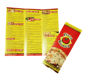
Brochures, when used well, can be worth their weight in gold as a marketing tool. They’re a fully portable means of conveying useful information to your clients, and as an added benefit, they can change hands several times before their shelf life is over. However, brochure design is not something you should just “wing.” Here are several tips to keep in mind to ensure that your brochure is as effective and professional as possible.
Use the Right Paper
If your brochure is going to be sitting outside (for example, at a stand for a nature tour), you would do well to choose a heavy weight paper for your print project. If it will be indoors at an elegant jewelry kiosk, a glossy, delicate magazine stock may be a better choice. Glossy magazine stock is also best for photographs or other intricate images.
Use Inks That Will Stand up to Wear, Tear, and Time
Choose a printer that uses high quality inks. To ensure this, you may request printed samples from a host of printers and test out their printed materials (drip water on them, leave them in the sun for a day, run them through the dyer, etc.) before deciding where to take your job.
Get Inspired
Pick up brochures from businesses you admire and choose the best and figure out what design elements you would like to emulate. Many brochures have been created before yours – there is no need to attempt to reinvent the wheel. You can also note design elements that you dislike and avoid making the same mistakes.
Use a Traditional Tri-Fold Design
It may be tempting to try a unique folding style, but there’s a reason that the tri-fold is the most popular brochure style. It is the easiest to design, print, and showcase. And people like the nifty and convenient way that they fold.
Create an Exciting Front Page
It’s common sense: the front page of your flyer should be used to draw the customer in. Use a bold headline and eye-catching design that will make customers want to grab a copy of your brochure and see what’s inside. The layout and graphics should add to the visual appeal. And underscore the message in your headline.
Don’t Be Cheap – Hire a Photographer or Artist
The better the images you use in your brochure, the better the results you will experience. The old adage is true: you get what you pay for. Unless you are a highly skilled artist or photographer, it’s a good idea to have a professional create your art for you.
Use Clear, Time-Tested Fonts
Creativity is great, but you shouldn’t get too creative with the fonts for your brochure. Your primary concerns should be legibility and bold impact. For this reason, you’ll want to stick with fonts that seem familiar and are easy to read. You don’t want the font to obscure your message, but rather emphasize it.
Choose A Quality Printer
There’s nothing like sub-par printed materials to undermine the credibility of any business. When you choose a high quality printer, your brochures are sure to reflect the quality of your company. Consider EliteFlyers.com as your brochure printing company; we pay attention to detail, never skimp on quality, and pride ourselves on competitive pricing.